Drawing and annotating your charts is one aspect of market analysis. Marking key points of interest, or using one of the many Fibonacci, Pattern, Pitchfork, Fan or Elliot Wave tools available on TradingLite, saves you from having to switch to another platform. In this article we will explore all of the drawing options available to you.

Drawing Toolbar
To the left of your TradingLite browser window, you will find the Drawing Toolbar:

Currently there are 5 different crosshair modes available to use.
These include:
Dashed horizontal/vertical
Dotted horizontal/vertical
Solid horizontal/vertical
Mouse / Hidden
Dot

The Magnet toggle allows you to quickly ‘snap’ to OHLC (Open, High, Low, Close) values on the chart, in addition to points drawn by Indicators, enabling the ability to accurately draw or measure between various points.

The Heatmap Lens provides you a zoomed-in view of the heatmap. This negates the need to constantly zoom in and out to view the Heatmap's values

Quickly Hide or Show all of your drawings via the toggle.

Pressing the Padlock icon allows you to lock all of your current drawings in place to prevent accidental selection preventing movement or deletion.
Note that once the 'Lock Drawings' is selected/locked, you will not be able to add additional drawings until you unselect/unlock.
You can also lock drawings individually by pressing the padlock icon within the mini menu that is displayed on completion/selection of a drawing.

The Stay in Drawing Mode toggle, will allow you to plot multiple instances of the same drawing without interruption.

Quickly Delete / Clear all drawings via this button.
If you accidentally press this, use the Undo button in the top toolbar to restore your drawings.
Drawing Tool List
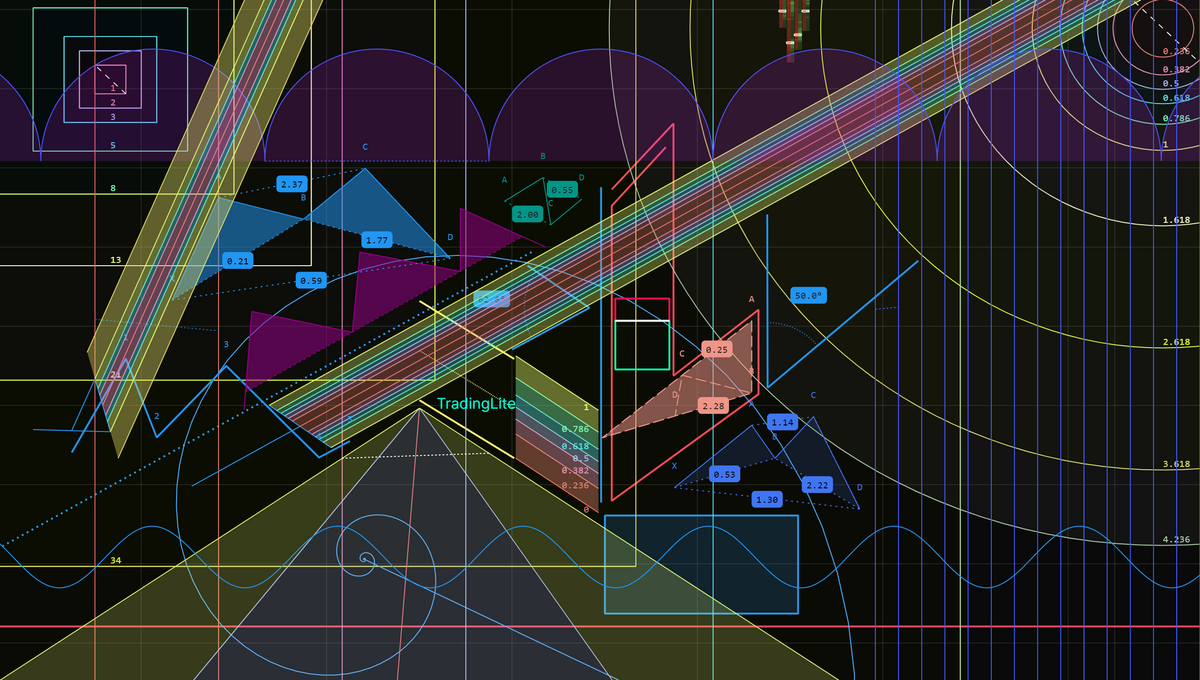
With over 30 drawing tools available, the chart is your canvas! 🎨 We will be providing a break down of all of the drawing tools in the near future. For now here is an list of all available tools broken down by category:
General:
Pencil
Path
Text
Rectangle
Parallel Channel
Tools:
Trend Angle
Measure
Risk/Reward
Lines:
Trendline
Ray
Horizontal Ray
Horizontal Line
Vertical Line
Fibonacci:
Fibonacci Retracement
Fibonacci Extension
Fibonacci Channel
Fibonacci Circles
Fibonacci Boxes
Fibonacci Spiral
Fibonacci Time Zone
Patterns:
ABCD Pattern
Head & Shoulders
Triangle Pattern
Three Drives Pattern
XABCD Pattern
Cypher Pattern
Repeating Patterns:
Sine Wave
Time Cycles
Cyclic Lines
Pitchforks:
Pitchfork
Pitchfork (Schiff)
Pitchfork (Modified Schiff)
Pitchfork (Inside)
Fans:
Gann Fan
Pitchfan
Elliot Waves:
Elliott Impulse (12345)
Elliott Triangle (ABCDE)
Elliott Triple Combo (WXYXZ)
Elliott Correction (ABC)
Elliott Double Combo (WXY)
The drawing tools have the following options available via the mini menu, that is displayed upon completion/selection:

Color & Transparency/Opacity/Fill
Line thickness (in px) - Click to change
Line style (solid, dash, dots) - Click to change
Padlock - Lock/Unlock this particular drawing
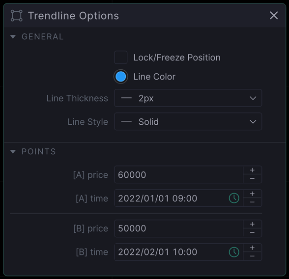
Cog - Manually selection of Line Colour, Thickness and Style, in addition to editable coordinates
Trash Can - Delete
A double click of your drawing will allow manual selection of the drawings’ parameters, within the drawing options window (shown below).
Drawing List
You may be the next Picasso with your drawings, but what good is that without the ability to organise them!
In the lower-left of your TradingLite chart window, you will find the Drawing List toggle.

Click this will open the Drawing List window. Here you can see all the drawings within your panes, allowing you to quickly select and adjust as required. Feel free to dock this window elsewhere if you prefer!
Drawing Options Window
Double clicking on any of your drawings will produce the Drawing Options Window.

Here you will have the ability to finely tune the drawings’ positions, allowing for greater accuracy across timeframe. This window also has the ability to be docked to suit your preferences.
Importantly and unlike other platforms, these X & Y positions are fixed, no matter the timeframe chosen, maintaining pin-point accuracy throughout.
Measure Tool
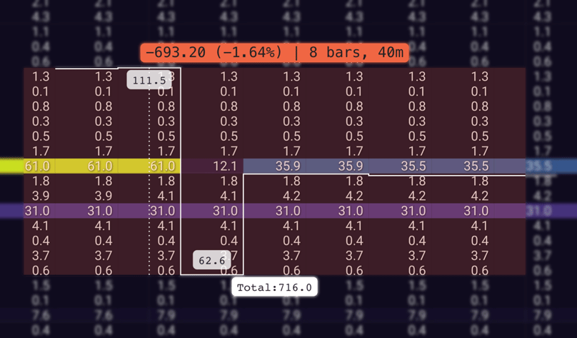
In addition to the standard price, percentage and time measurements, if the TradingLite Heatmap is active, the measure tool will also show the cumulative order book values within the measured range.

The value at the top shows the largest value of orders within the Order Book, with the value at the bottom showing the lowest value of orders within the Order Book, over the measured period.
The Total: value shows the cumulative value of all orders within the space measured.
In effect, an upward trajectory shows an increase in value of liquidity / limit orders being placed, whilst a downward trajectory shows a decrease in value of liquidity / limit orders being placed.
Ranges
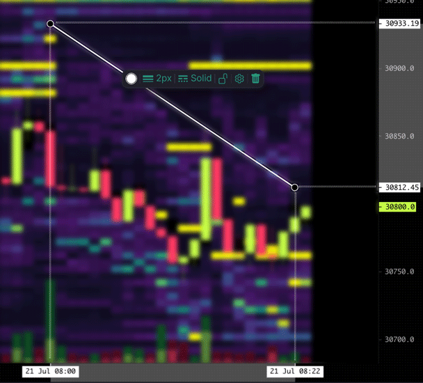
When creating, editing or selecting a drawing, X & Y axis label ranges are highlighted to show each of their coordinates.

Suggestions
Missing a particular drawing tool? Or style option? Have a browse over at our Suggestions/Feedback area. Make sure you search to determine if your suggestions has not already been mentioned. If so, give it a vote! If not, feel free to create a new suggestion.
Was this page helpful?